
Designing Ravo.io to be more user-friendly and exciting to use.
CLIENT
AREA
DURATION
Ravo.io
Social Media UI/UX
4 months
TOOLS
Figma, Google Surveys
My Role
RESEARCH
Conducted user and competitor research. Analyzed data to inform the direction of Ravo's design & marketing strategy.
IDEATION
Brainstormed possible solutions based on conducted research. Prioritized solutions for user engagement from general users and content creators, as well as designs that could be developed within a reasonable timeline.
DESIGN & PRESENTATION
Worked with the creative director to produce designs that captured Ravo's brand. Communicated design rationale and research findings to stakeholders.

Description
WHAT IS RAVO?
Ravo.io is a social media platform where users can share or gather opinions through polls or rankings such as top 4's. Ravo also hosts a library of items used to create these polls and top 4's. These item pages are informational hubs, providing descriptions, images, and with enough collected data, statistics on users' opinions.
PROJECT OVERVIEW
Following a usability audit of the platform, I pinpointed several design elements and user flows that could benefit from redesign or further investigation. These improvements aimed to enhance the site's usability, accessibility, and interactivity.
THE PROBLEM
Overall, interactions were lower than desired. Users were not posting as many Top 4's and Polls as expected, and the profile page was underutilized.
Identifying Issues
UNINTUITIVE INTERACTIONS
Primary interactions should be obvious, and easy to use. The information architecture and visual display of actions should be intuitive to minimize friction.

OVERWHELMING POSTING FLOW
The posting flow was initially overwhelming for several reasons. Multiple colors competed for attention, the posting pop-up was oversized and extended beyond the page, and the interaction design was not very intuitive.

INCONSISTENT COMPONENTS & STYLES
On the platform, there were 3 different shapes for buttons (fully round, square, and rounded corner), some with inconsistent colors previously used. Also, some of these buttons felt to use inappropriate priority states, such as filled vs ghost vs stand alone text style buttons.
.jpg)
SEE-THROUGH BACKGROUNDS, VISUAL NOISE & ACCESSIBILITY
With multi-colored blobs in the background and a translucent pop-up, it sometimes felt overwhelming to look at. On top of that, my clients had chosen to design in only a dark mode. This became a problem during the daytime as it was hard to see the interface as well as one could at night.

Setting Goals
With a clunky navigation, unintuitive interactions, a distracting background, and a lengthy posting flow, the platform had a lot to gain from either removing or redesigning these barriers.
1. Perform research to understand our users and what they expect from Ravo.
2. Increase user posting follow-through by decreasing barriers and friction to users.
3. Simplify UI to be less distracting but still maintain the playful nature of the brand.
4. Improve the navigation and interactions to be more intuitive and easy to use.
THE CHALLENGE
How might we design to increase user retention, posting follow-through, and overall usability?
Setting Goals
1. Perform research to understand our users and what they expect from Ravo.
2. Increase user posting follow-through by decreasing barriers and friction to users.
3. Simplify UI to be less distracting but still maintain the playful nature of the brand.
4. Improve the navigation and interactions to be more intuitive and easy to use.
The Challenge
How might we design Ravo to feel less like work and more like an exciting experience for the user?
With a clunky navigation, unintuitive interactions, a distracting background, and a lengthy posting flow, the platform had a lot to gain from either removing or redesigning these barriers.
SETTING GOALS
1. Perform research to understand our users and what they expect from Ravo.
2. Increase user posting follow-through by decreasing barriers and friction to users.
3. Simplify UI to be less distracting but still maintain the playful nature of the brand.
4. Improve the navigation and interactions to be more intuitive and easy to use.
The Goals
01
Increase user posting follow-through by decreasing barriers and friction to users.
02
Simplify UI to be less distracting but still maintain the playful nature of the brand.
03
Improve the navigation and interactions to be more intuitive and easy to use.

UNDERSTANDING
What makes us obsessed with social media?
Research Methods
SECONDARY RESEARCH
SURVEYS & INTERVIEWS
USER TESTING
Online research papers & articles
12 survey respondents & 3 in person interviews
53% task success rate from user tests
SECONDARY RESEARCH FINDINGS
Established research tells us that social media satisfies our innate need for connection. Providing a platform to communicate and engage with those we care about. Social media can offer a sense of validation and boost self-esteem through likes, comments, and shares. It serves as a convenient source of information, entertainment, and novelty, keeping users engaged. Source
SURVEY & INTERVIEW FINDINGS
To gain a deeper understanding of our users, I sought to explore their daily habits, the features of Ravo that appealed to them most, their motivations for engaging with social media, and their fears about posting.
I conducted a survey consisting of 16 questions, some multiple choice and some open-ended, and received 12 responses, providing valuable insights into our users' behaviors and preferences.


FAVORITE & LEAST FAVORITE ASPECTS OF SOCIAL MEDIA?
"Favorite: Staying connected with friends and family and sharing ideas. Least Favorite: Misunderstandings and people being mean during disagreements."
—Quote from a user's survey.

USER TESTING
I performed a handful of in-person and online user tests on Ravo before the redesign. I asked or watched users complete around 13 key tasks on Ravo. The completion rate for the user posting flow resulted in about a 61% task completion rate, for the item creation flow it was a 42% task completion rate, and the task completion rate for all tasks combined was about 51%.
Key Insights
1. Users didn’t understand why or how to create an item to post a Top 4 or Poll. Users would want to create a top 4 but hit a wall when they found out they had to create an item to do so.
2. Some users didn’t intuitively understand the drag and drop interaction. Some users struggled with understanding how to even get started with a Poll or Top 4.
3. Higher interest in spaces than voting. Users were most excited about joining groups of similar interests (spaces) on Ravo and liked the idea of a positive environment to share opinions.
4. Users weren’t utilizing all the pages such as the profile, stacks, and spaces. Users were sticking to the feed and not exploring beyond that. Some information locations were confusing for users.
Analysis
SYNTHESIZING PERSONAS
Research was then synthesized down into profiles describing their interests, pain points and expectations of Ravo. Four distinct groups were identified that would need to be taken into consideration when designing future solutions.


EMPATHIZE
Focusing on the general user, a user journey was created to empathize with them as we traveled through their potential experience on the platform, determining their goals, and possible hold ups and potential solutions.

USER FLOW
For certain identified user experience problems, user flows were used to help identify at what step a user pain point occurs within the current design of Ravo and how the flow could be improved. For the user flow below, the pain points discovered pointed to where and possibly why the user was abandoning before posting or finishing a posting task.

Strategize & Ideate
After gaining a comprehensive understanding of the platform, including the co-founders' objectives, user needs, and insights into the psychology of user engagement on social media platforms, I proceeded to prioritize the required changes.
Strategically we decided to initially focus on acquiring general users and content creators and to defer advertising efforts until we had established a substantial user base.
Brainstorming
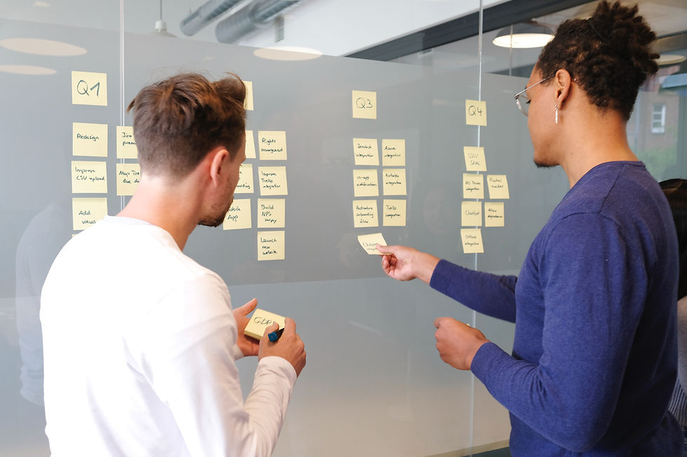
WIREFRAMING
When ideating for complex interactions, I would jot down notes on my ideas and then start sketching wireframes on paper to visualize them, gradually progressing to high-fidelity prototypes. For simpler issues, I might directly create a high-fidelity wireframe and refine it to demonstrate my concept for presentation.

Visual Redesign
COLORS
After a few discussions with the co-founders about the importance of accessibility and the need for a light mode, we made the decision to transition the platform to be exclusively light mode. This decision was made to streamline development, focusing our design and development efforts solely on the light mode.
.png)
CONSOLIDATING COMPONENTS
Buttons were consolidated into a single fully round style with different priorities and interaction states were defined. Colors and text styles were defined to reduce the variations found on the platform.
.jpg)
LIGHT MODE
After these colors and styles were applied this was the result. I also convinced the co-founders to remove the color blobs in the background to allow user's focus to remain on the task they are completing.

Information Architecture
PROPOSING A NEW NAVIGATION ARCHITECTURE
I felt that the navigation could be simplified and that the "People" page that contained a user's followers and whom they are following could be added to the profile page as most social media follow this form of organization so will be familiar to the user. "Job Title" was also removed from the profile page as it seemed irrelevant to the current direction of Ravo.
.png)
.png)
Finding Common Ground
ICONS & LABELS - BRANDING VS UX
As a UX designer, I felt it was important to prioritize choosing commonly used icons and labels for buttons and navigation. One of the co-founders felt that using unique icons and labels was integral to standing out as a brand. I worried about the user experience but understood the co-founder's sentiment for branding.
MEETING IN THE MIDDLE
Ultimately we were able to find a middle ground that balanced brand and user experience where all icons stayed the same, one of the navigation pages (People) was moved to what was determined as a more intuitive location (Profile Page), and the wording was changed to more commonly used labels for two of the navigation icons.


Feedback & Iterations
POSTING FLOW & ITEM EDITOR REDESIGN FEEDBACK
Although the embedded item editor in the posting flow was initially well-liked by stakeholders, it was decided to redesign the posting flow with an item creation pop-up instead.
INITIAL DESIGN
My initial redesign of the user posting flow included an embedded item creation tool. However, it became evident after presenting this design that it would pose several more coding challenges compared to the previous pop-up version. Additionally, after conducting some user testing, concerns were raised about whether it truly represented the best design for ease of use.

AFTER FEEDBACK & ITERATION
It was decided to redesign the posting flow with an item creation pop-up since it would be easier to code, help the user stay focused on just the item creation flow, and allow us to duplicate the pop-up throughout Ravo in different interactions outside of the posting flow.

The Results
+63%
TASK COMPLETION
User testing showed a 63% increase in task completion with the redesign of the posting flow and item creation interactions. With an initial task completion of 51% and a task completion rate of 83% after the redesign.

Key Design Changes
The Goals
01
Increase user posting follow-through by decreasing barriers and friction to users.
03
Improve the navigation and interactions to be more intuitive and easy to use.
02
Simplify UI to be less distracting but still maintain the playful nature of the brand.

Top 4 Posting Flow
The Top 4 posting user flow was redesigned to more simple, requiring less steps and a strait forward user interface.
.jpg)
Item Creation Flow
The item creation flow was redesigned to be segmented into 3 steps so that the user wouldn't become overwhelmed, gain some buy in when reaching the second step of adding images when many people would abandon, as well as require less input overall to decrease creation time.


Profile Page & New Information Architecture
Originally, there was a "People" option in the navigation that contained a user's following. To be more intuitive I relocated a user's following and other needed personnel information in the profile page. The profile page was also redesigned to be more user-friendly and provide more functional value.
KPI's
TOP 4 POSTING FLOW
The task success rate increased by 139% coming out to an 83% success rate for the final design. Ways that the task success rate could potentially be increased would be by removing the perceived requirement of selecting an item or creating an item as well as relying on images for the post to look good.
ITEM CREATION
The task success rate increased by 139% coming out to an 83% success rate for the final design. Ways that the task success rate could potentially be increased would be by removing the perceived requirement of selecting an item or creating an item as well as relying on images for the post to look good.
Reflection
Even though working for a small start-up allowed me to be very influential in some design decisions, I also learned how important it is to advocate for the user. As I learned the user's needs and habits can easily be forgotten in business goals and desired outcomes. Some of the expectations on how users "should" behave were unrealistic based on research findings. I found that if the user was not often recentered the desired outcome of the product would sometimes stray too far from what seemed achievable. Ultimately, design decisions should be made based on the sweet spot that is between how the user actually behaves and business goals.
